01 PAPER PROTOTYPING
This assignment was to practice making a lo-fi prototype using simple materials, such as pen and paper. I tried to create a prototype for a fitness tracker application. I chose a ‘smart watch’ to be the device that I was going to design the application for.
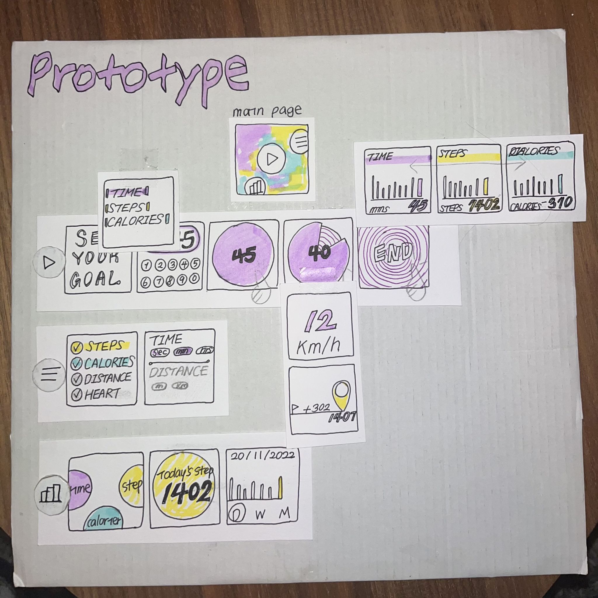
Early Prototype
I drew a square box which represent the screen of the watch. Screen that are consecutive were put in a same paper sheet, next to each other. For the additional screens, I made a separate paper sheet that belongs to certain screen. Main page of the application shows three icons that connects to each page.
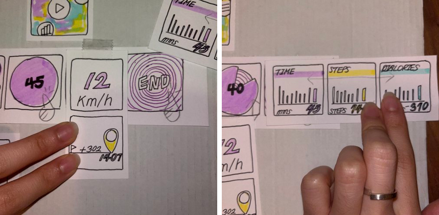
The first page is a ‘Start’ page, where the user can start tracking the training. First, user can set the goal for the training. They can choose which standard they are going to use between time, steps, calories and etc. After selecting, they can insert a certain number by tapping the numbers. Then it shows the circle with the number. As they tap the circle, it starts moving like a clock. During the training, they can check the current speed or steps they took by scrolling the screen. When the training ends, they can get to the page where it shows the record of the day.
The second page is ‘Setting’ page, where the user can customize some function of the app. They can select what to activate for tracking or not.
Also, The third page is ‘Record’ page, where it shows the records for the training. There is a icons for each track such as steps, calories and times. User can swipe it towards the side they want and can check the records.
Testing and Feedback
The task I asked for testing was 'Set your goal to 45 minutes of running, and start running. Check your current speed during training, and check the calories you burned after.' Before testing, I explained briefly about which how the structure of the prototype works.
As shown in the video, most of the testers were quite confused about which pages belonged to which. As for the positive feedback about the usability of the application, they emphasized clear separation on the use of the color per function. Also, the overall visual design. Two testers mentioned the use of the button on the watch, that it would be useful for better accessibility or efficiency if you can control the app with a button. I also could find that most of them did not find the importance of customizing functions. The tester who actually is the user of the smart watch also pointed out, that the screen is too small for the number keyboard if you have big fingers. It is also mentioned a few times that the record pages could be simpler.
Final Prototypes
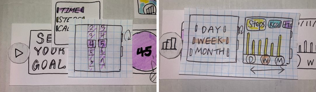
For the final prototype, I tried to add the button control first as a response to the feedback. I got the inspiration from 'Timer' app by Apple. The users can scroll up and down the number using the button. I also simplified the 'Setting' page. First the user can select the period. From the next page, they can go easily to different pages with only one movement.
02 EXPLORATORY PROTOTYPING
During the course 'Prototyping & testing' I conducted a small experiment to test the assumption that images are more efficient in delivering information than text. This assumption is called 'Picture Superiority Effect.' I designed an A/B test, where participants were shown a static page with information, and then had to mention the information they remembered from that page. One group was shown a page with images, while the other group was shown a page with text.
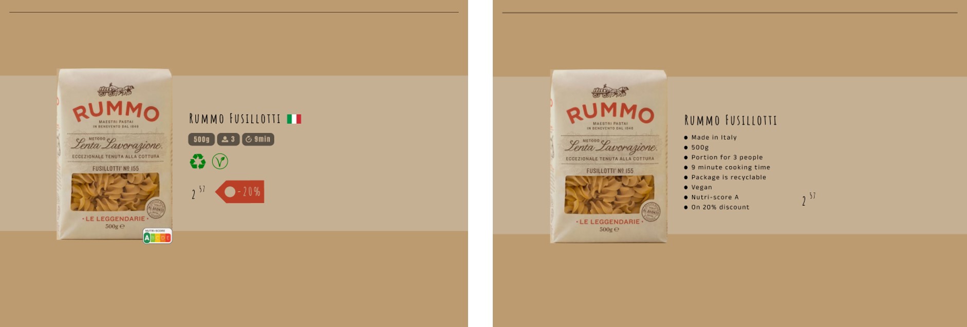
The page included information about a pack of pasta, such as size, vegan, discount etc.
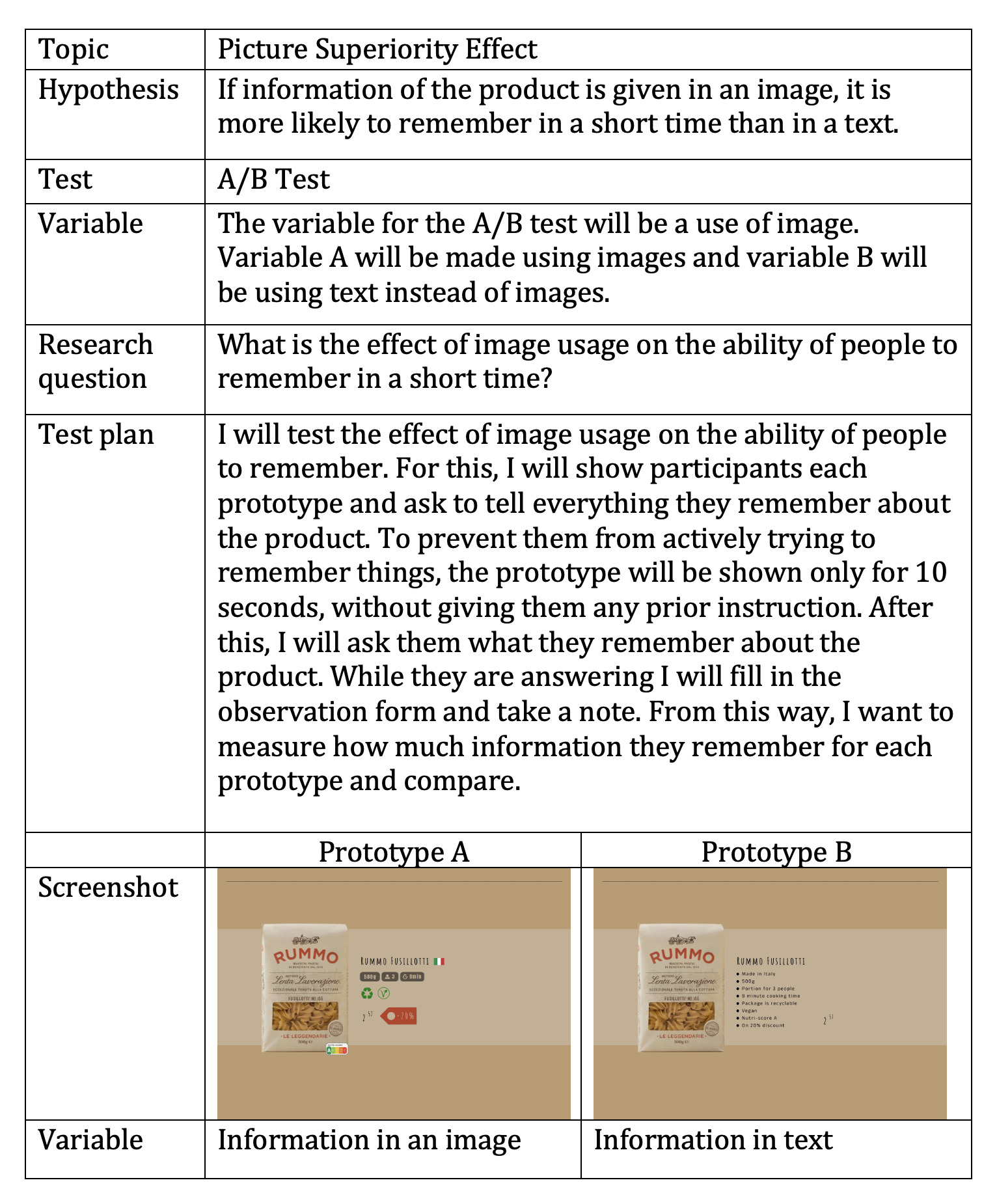
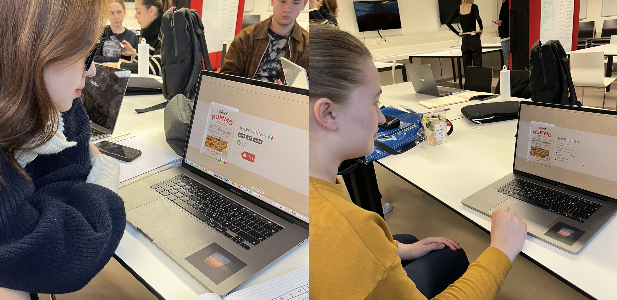
Ten people participated in the experiment. Participants all used the same device and were given no prior instructions. They had ten seconds to look at the page, after which they were directly asked to mention the information they remember.
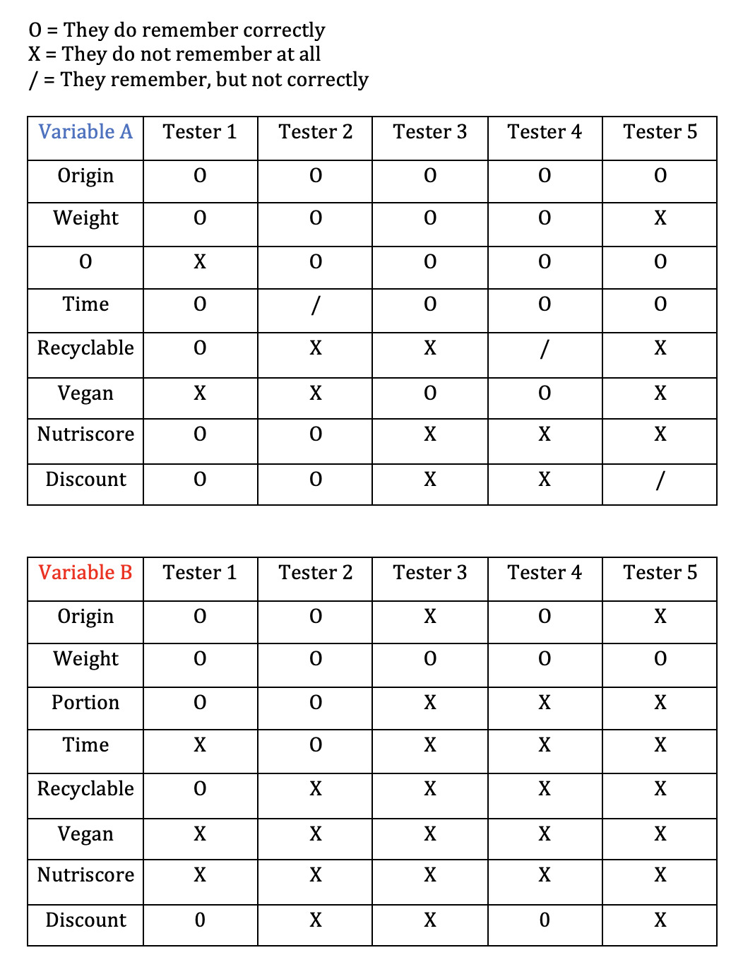
The results were supportive of the hypothesis. Testers with variable A (image) remembered more information. Testers for variable B (text) tended to remember only the first few lines of information.