I have worked on several assignments for the course 'Interaction Design.' During the course, I learned how to design the visual aspects of an online application, and how to give users a seamless experience.
01 WEB SHOP: ME, MYSELF & I
I worked on an online shop for clothing that incorporated design patterns and UI best practices. The design consists of a homepage, filters, product pages and login page. Throughout the design, I applied best practices such as progressive disclosure, call to action and responsiveness.
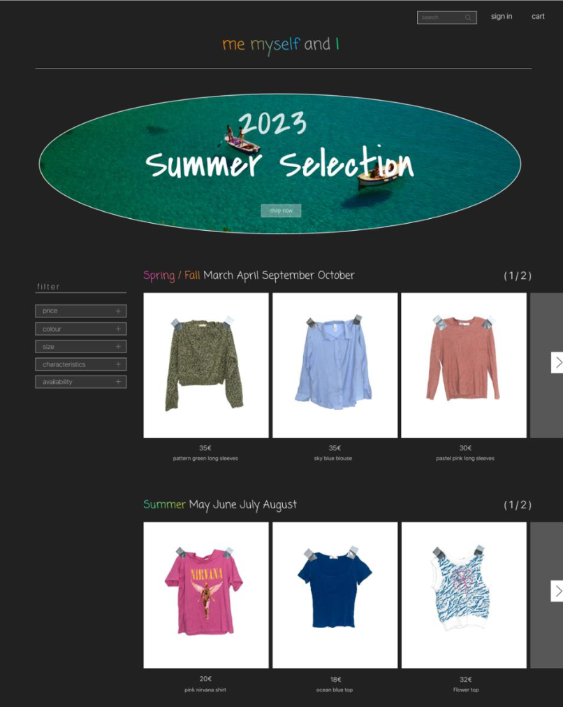
The homepage employed a design technique galled grid of equal . This technique ensures that a visitor's attention is distributed evenly across the page.
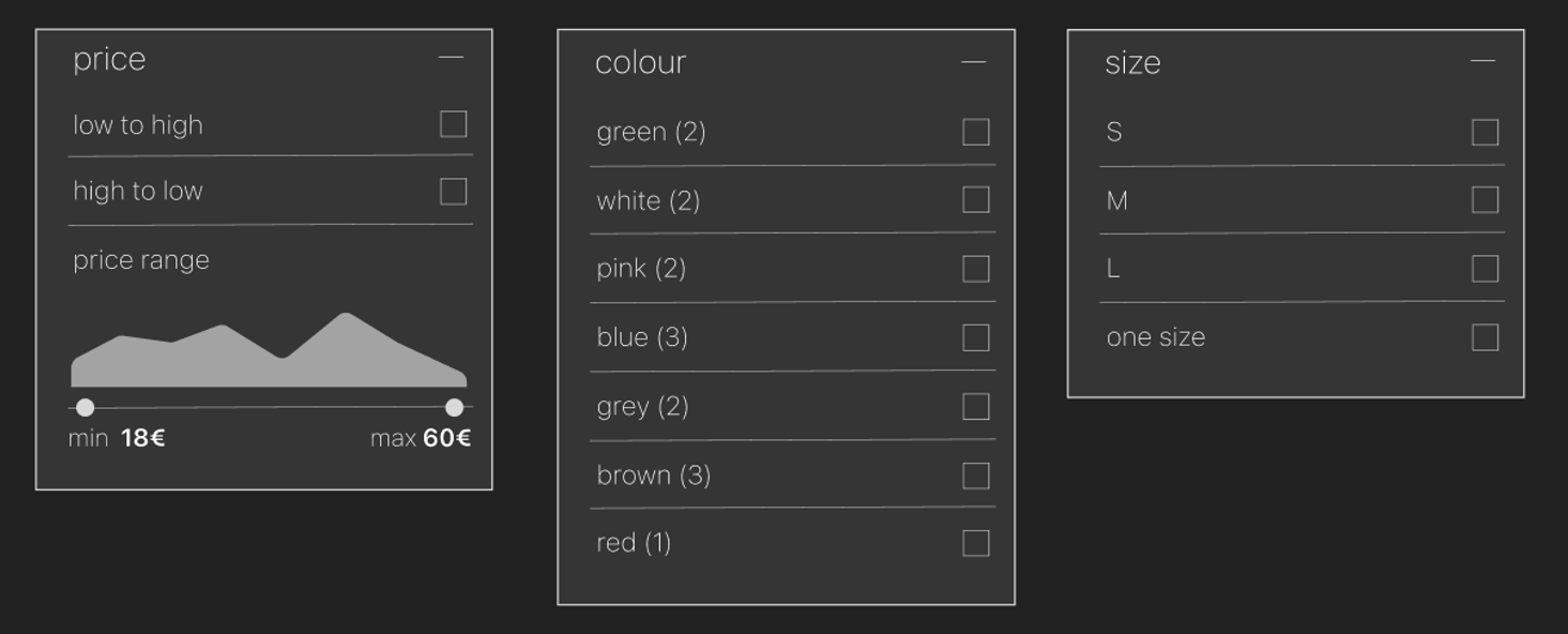
I used progressive disclosure for the filters. Filters can be expanded and closed by the user, so that only the relevant filters are disclosed. if all filter options were open at all times, it may unintentionally overwhelm users. I also added a reset button for the filter, so the users can easily remove the filter applied.
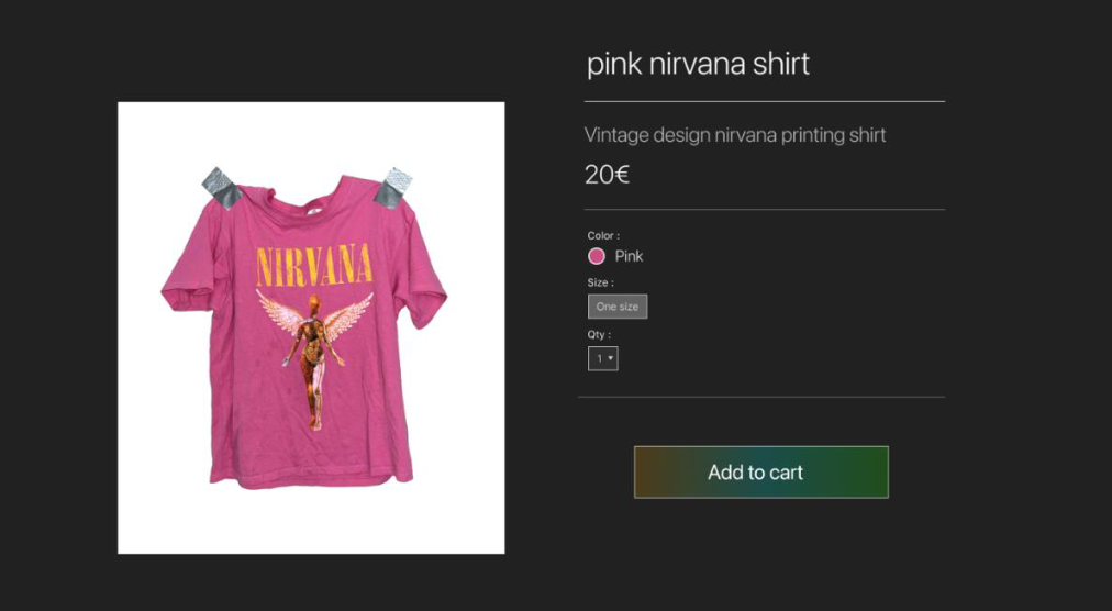
A common technique used in web shops is call to action . The 'Add to Cart' button is the main action at the product page, and has a more striking design with a strong contrast with the other elements. call to action is also used on the homepage. Thumbnails large enough so that people intuitively click on them for a detailed page.
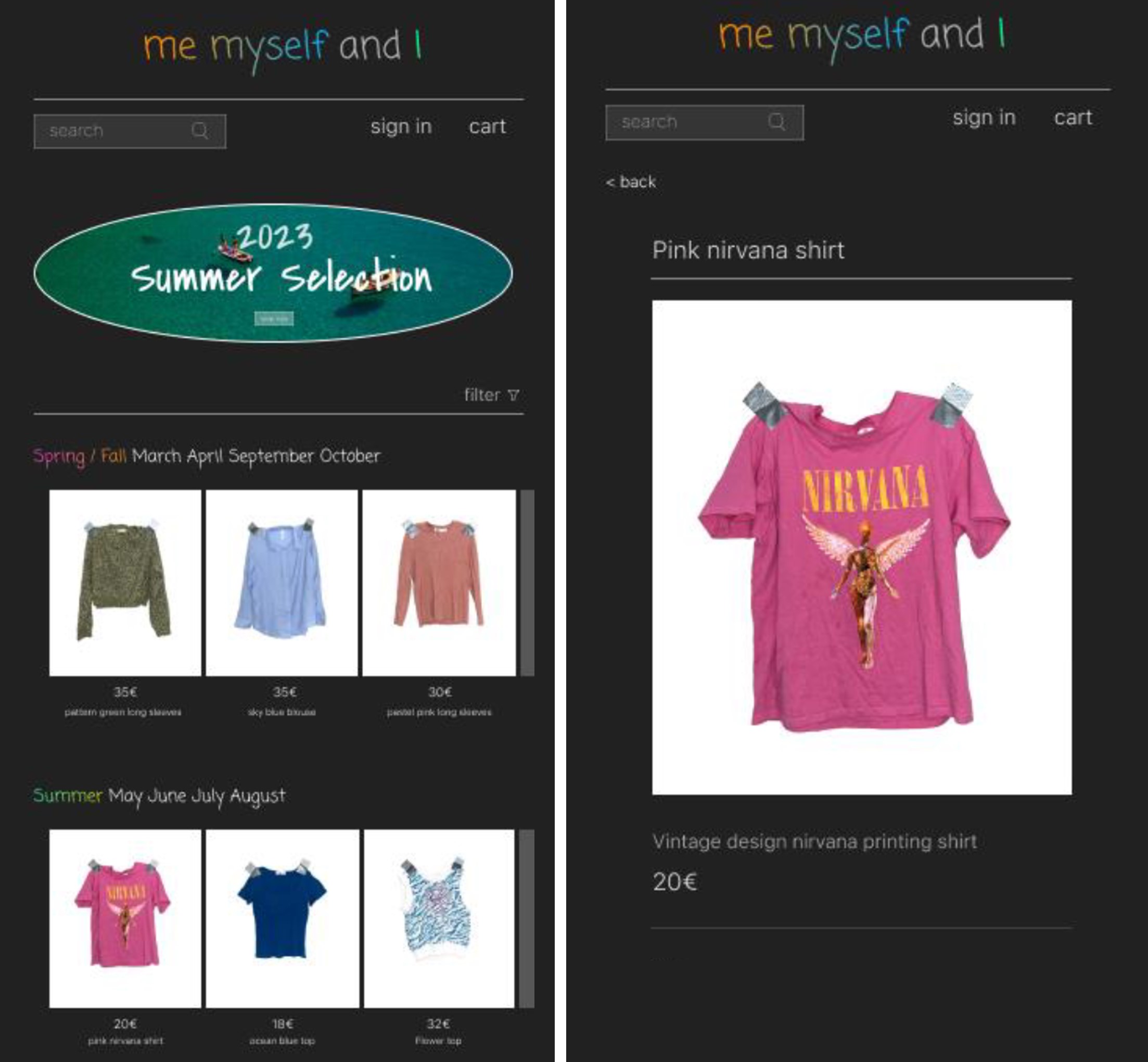
Considering that many people use their phones to visit websites, I made sure that all pages are responsive . Responsive websites can rearranges themselves to that it can viewed on any screen size.
02 WEB STORY: READING A WAVE
Assignment [...]
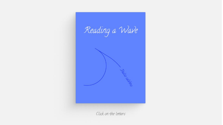
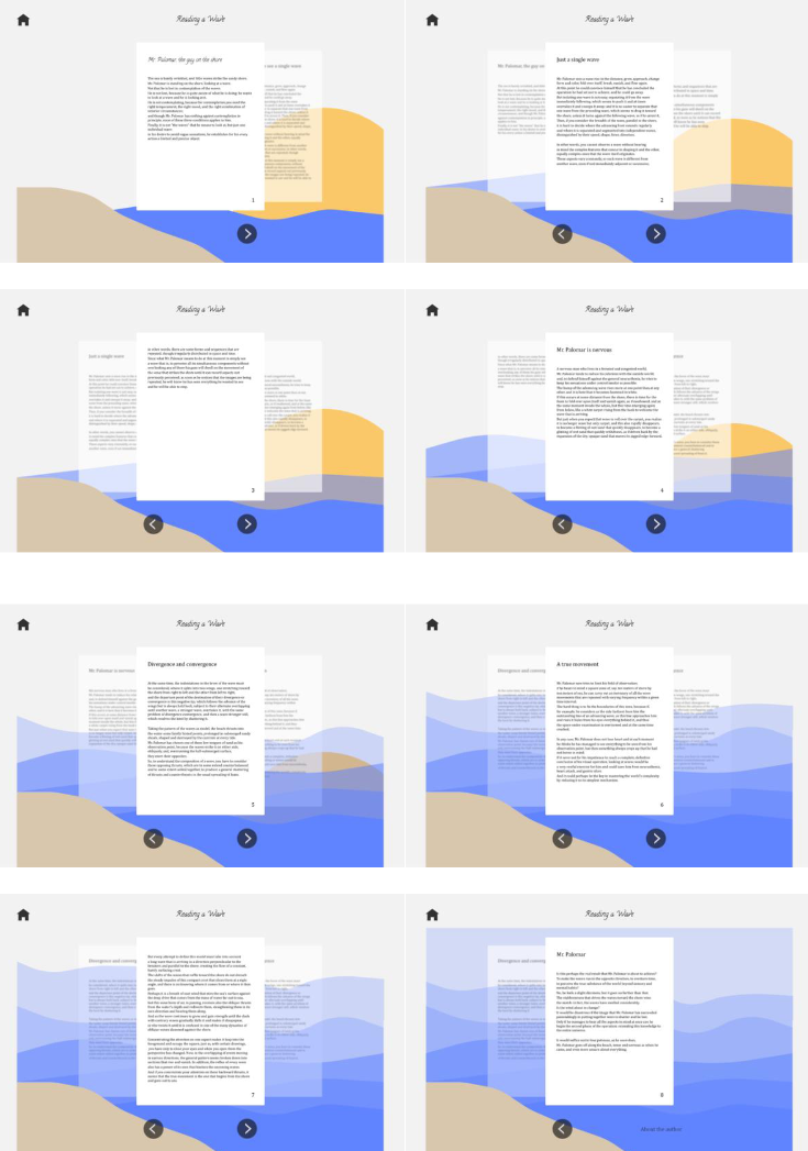
The web story uses a pyramid navigation pattern. Since it is a website about a story, I attempted to make it interesting and easy to navigate by using the format of a book. Users can navigate from one page to the next or from the main page to each page. I used the home icon as an escase hatch . The icon of a house is something that most people are familiar with.
The background changes as the reader progresses through the story.
A design technique called center stage was applied on the website to help users focus on reading the text. I also tried to apply progressive disclosure to keep their focus on the current page, yet giving them a feeling of reading a book.
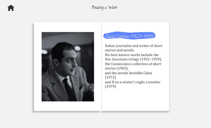
People can read information about the author on the author page.
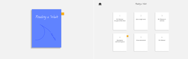
The bookmark option is also designed to allow users control over navigation in the case that they accidentally return to the main page or wish to continue reading later.